Showing posts with label exhibition. Show all posts

Wednesday, 6 April 2016

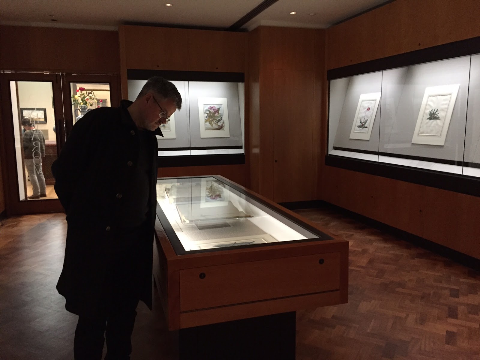
Crawling with Life: An exhibition of flora and fauna at the Fitzwilliam Museum


The first thing you see when you enter the small exhibition of 17th and 18th-century flower drawings, is a giant black beetle with three impressive-looking horns.

 The beetle sits in a typical old-fashioned flora and fauna display case; it's pinned to a board in the classic way of a scientific specimen.

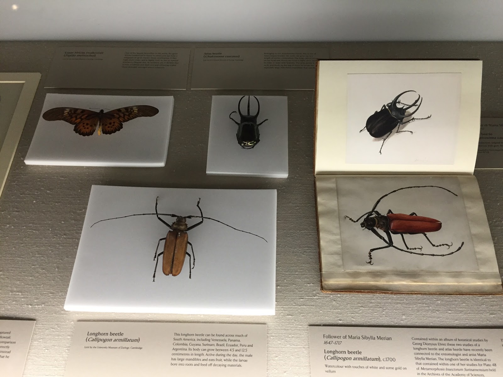
In fact, this beetle, alongside another beetle and a butterfly, have been borrowed from the Zoology Museum in Cambridge and placed next to watercolour images of themselves.  It is as if we have the portrait and the sitter all in the same glass vitrine.

Atlas beetle (Zoology Museum, Cambridge) and Follower of Merian, Atlas Beetle, c.1700, watercolour with some white and gold
The watercolours are by an anonymous artist from around 1700; they are beautifully detailed and strangely evocative.  The atlas beetle casts a shadow onto its pristine white background.  Is it crawling across a sheet of paper?  Its legs are exquisitely fragile.  The beetle appears to be moving diagonally upwards, from left to right.  Although it's 2-D paint, it seems more alive than the dead husk next to it.

Add caption
The curatorial decision to include some real biological specimens is genius.  Seeing them transports you back into the world of early modern science, the world before photography and X-rays, the world when artists were scientists and where the only pictures we had of flowers and insects were the pictures painted, etched and drawn by people.

Is it art?  Is it science?  These distinctions blur in your mind as you peer at the displays.


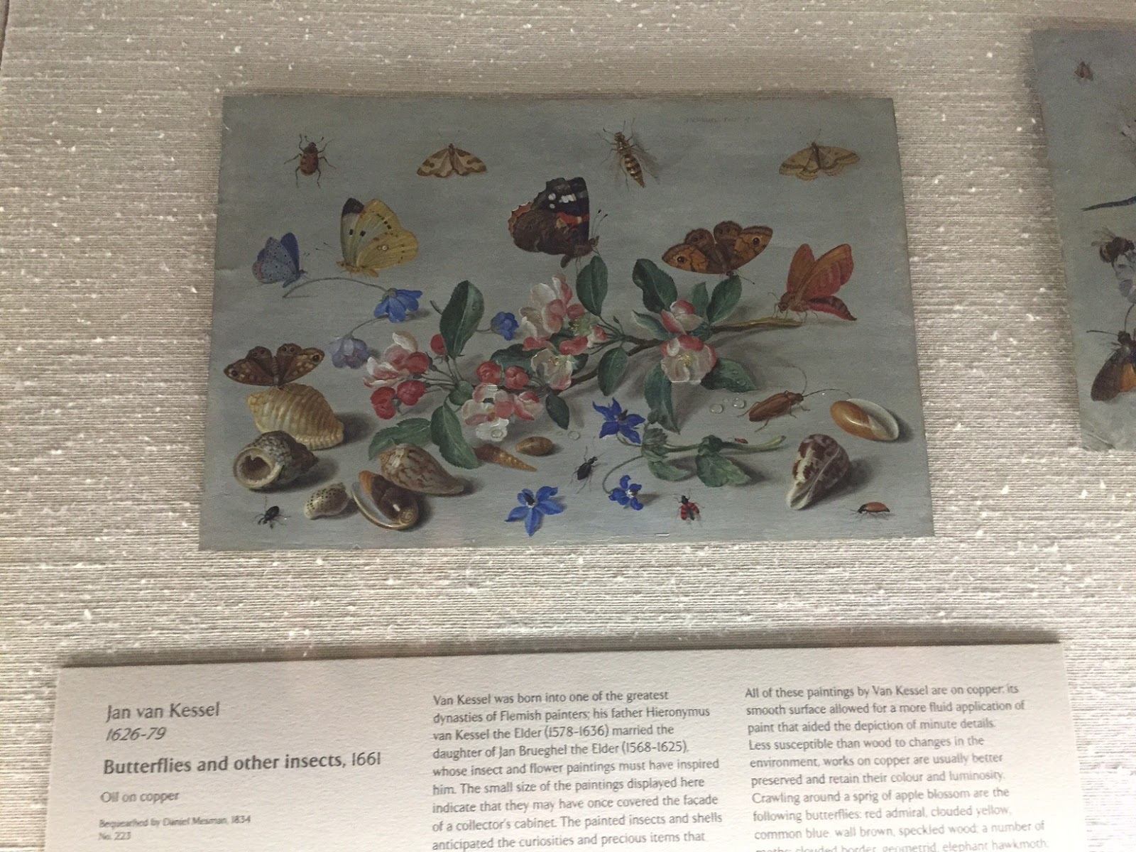
Jan van Kessel, detail from Butterflies and Other Insects, 1661, oil on copper

This Flemish artist, Jan van Kessel, got so carried away by the ecstasy of meticulous naturalism that he included transparent drops of water alongside his blossoms, shells and creepy crawlies.  Look at the drops practically quivering on the leaves and on the pale blue-grey ground.

Add caption

Another nice thing about the exhibition is the presence of two women painters.  In the world of botanical and zoological art, women were leading.  Indeed, practically the inventor of the entire genre was the Frankfurt-born Maria Sibylla Merian whose strangely hypnotic renderings of creatures and plants became the benchmark for all who followed.

Look at her weird depiction of snails and a beetle cavorting under a fleshy plant, all in front of the ubiquitous white background.  Merian did a cut-away to show a snail laying eggs.  Centuries later, nature photographers and David Attenborough's camera team are still vying to capture similar intimacies.


Maria Sibylla Merian, detail from Hyporicum baxiforum, with several snails and a beetle, 1695, watercolour

 The white background is not entirely ubiquitous, though.  Here is another woman, Margaretha Barbara Dietzsch, who, along with her brother, liked to use a black ground. 


Margaretha Barbara Dietzsch, detail from Common Dandelion with a Garden Tiger Moth, watercolour, bodycolour and gum Arabic, 18th C.

A strange nocturnal world unfolds.  It's almost a still life, almost a flower painting (like those in Gallery 17; see my blog post), but without the allegory, without the wilting leaves and the mementi mori.  Yes, a quarter of the dandelion clock is blown away but the caterpillar climbs determinedly on.  And everything is ripe with growth and bursting with life.  These are not melancholy pictures.  This is part science, part art, and 100% rhopography:  the depiction of the trivial, the love of the humble.


Visit the exhibition Crawling with Life: Flower Drawings from the Henry Rogers Broughton Bequest.

Fitzwilliam Museum, Cambridge, Gallery 14.
Ends Sun, 8 May 2016.

It is totally worth seeing!  It's small, too, so you won't exhaust yourself. And free!

Related blog posts:


Permalink: http://artincambridge.blogspot.com/2016/03/crawling-with-life-at-fitzwilliam-museum.html

Wednesday, 23 March 2016

British painting at the new Heong gallery: Is it abstract?


There is a new gallery in town.  It is the Heong Gallery.  Where is it?  Go to Regent Street in Cambridge; opposite Parker's Piece and across the road from the Pizza Hut, is Downing College.  Walk through the main entrance across the gravel path and past the Porter's Lodge; turn left.  And there it is.

Heong gallery, the entrance façade

It's in the old stables and was wonderfully re-purposed by Caruso St John Architects.  It opened on 6 Feb 2016 with an exhibition of British painting in the 50s and 60s.

I visited as part of the  symposium Generation Painting: Abstraction and British Art 1955-65, held at Downing on Sat, 5 March.

Now, the concept of 'abstraction' is interesting in the context of the current exhibition.

Detail from Patrick Heron's Soft Vermilion with Orange and Red: April 1965, 1965 (oil on canvas)
Above is a detail from a painting whose very title shouts "Hey, I'm abstract! Look at me! No figurative content in me!  No illusion to be seen here! Just plain old real paint.'  Except not quite, perhaps?  Because why is the vermilion 'soft'?  And why is the word 'April' part of the title?

As was pointed out by one speaker during the very interesting symposium, these 1950s/60s painters from Cornwall (Patrick Heron lived in Cornwall when he painted this) remained attached to the light and sea and atmosphere of their landscape.


And David Hockney's absolutely wonderful Hollywood Garden (1965) is definitely not abstract.

Detail from David Hockney's Hollywood Garden, 1965, pencil and watercolour on card

There are some witty references to abstraction, and there is a play with the tension between surface and depth, the horizontal line and the vertical shapes, like starlings on a wire, the drooping umbrella, the bush like a boulder.  At the symposium, Martin Hammer (University of Kent) was brilliant on Hockney:  "our involuntary urge to recognise."


Allen Jones, Parachutist, 1963 (Fitzwilliam Museum)

Detail of the preceding

Allen Jones's Parachutist (1963) is a wonderfully witty and juicily 'painterly' juxtaposition of the overtly figurative and the ambiguously abstract.  Are those vertical shapes stripes of yellow, green and blue, like the stripes in a painting by Morris Louis?
Great sky lights at the Heong Gallery


A picture window onto Downing lawns that looks like a literal picture, next to an actual picture by Roger Hilton, January 1962 (tall white), 1962.  Below is the same picture window viewed from the outside in.

Heong gallery, viewed from the Downing lawn

Visit the show! It's fantastic!  And so is the gallery.  Totally free, too.
The catalogue costs £12.

Open:
Wed 10 am - 8 pm
Sat, Sun, Bank Hols 10 am - 6 pm

Exhibition: Generation Painting 1955-65
British Art from the Collection of Sir Alan Bowness
Ends 22 May 2016.


Wednesday, 9 March 2016

My four favourites at the Children's Book Illustration exhibition


Alas, once again I post too late for any of you to visit this show.  However, the MA Children's Book Illustration Graduation Exhibition happens every year at the Cambridge School of Art (part of Anglia Ruskin University) so put it in your diary for 2017!  It is always a highlight that lifts the spirits.

Here are my favourites:

© Katyuli Lloyd

© Katie Sheppard


© Sanghyun Chun


© Anuska Allepuz

I appear to have a penchant for black-and-white magical-realism panoramas... :-) But as you can see there were plenty of other kinds of illustration in the show as well.


You might also like my blog post about the 2014 MA Children's Book Illustration show:  http://artincambridge.blogspot.co.uk/2014/03/ma-childrens-book-illustration-degree.html

Sunday, 6 March 2016

Grantchester Artists Show: I bought art!


On Friday, I went to the Grantchester Artists Show in the Grantchester Village Hall.  And I bought two paintings!


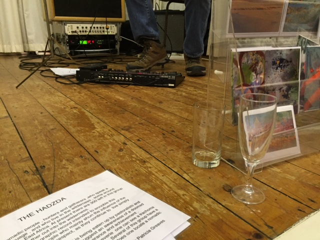
There was live music (a good-mood-spreading electric jazz'n'rock guitarist), champagne and art.  And lots and lots of people.


Detail from Katherine Firth's Garlic & Onions, oil on board


Tess Recordon's painting Winter  (oil) and
Penelope Hayes' 2gether (ceramic)


Most exciting of all, I found two paintings that I loved and I bought them!

Alan Coulson, From Chanctonbury Ring

This is Alan Coulson's acrylic painting From Chanctonbury Ring.  That red dot is mine!  This is a very small and very atmospheric, totally lovely and mysterious sun-and-shade-drenched landscape.

Vera Rosenberry, Osprey and Chair

This is Vera Rosenberry's watercolour painting Osprey and Chair.  The red dot is also mine!  There is a quirky predator bird, an enigmatic shadow, magical perspective, a chair painted in loving detail, a circular moon that draws the shadows rather than casts them, and an overall wonderful dream-making atmosphere. 

My paintings in situ!  You can see their respective sizes. :-)

I am so excited about my two purchases.  I pick them up later today.  There is nothing quite like the rush from art buying, an economic transaction like no other as it also involves the soul and the heart.

Detail from Vera Rosenberry's Chough and Chair
(a chough, pronounced 'chuff', is a bird from the crow family)
Don't you love this chough's expression?


I loved this local show because it enabled me to buy art I could afford from artists who were actually there.  I had a lovely chat with Vera Rosenberry who studied art in Boston and lives in Cambridge; she is also an illustrator and member of the Cambridge Drawing Society:  Vera Rosenberry.  I just missed Alan Coulson but found out that he is a retired molecular biologist who loves painting (not to be confused with the London-based portrait artist Alan Coulson):  Alan Coulson, the scientist.

Unfortunately, I'm posting this a little late for my readers to rush out and visit but I absolutely recommend a visit to the next Grantchester Artists Show.

Shall I post pictures of what these paintings look like on my walls?


Thursday, 5 November 2015

Three London art shows in November


November 2015.  London exhibitions.  My top three picks:


•  Ai Wei Wei at the Royal Academy.
Ends 13 Dec 2015.


•  Artist & Empire at Tate Britain.
Starts 25 Nov.  Ends 10 April 2016.
George Stubbs, Cheetah, Stag and Two Indians, 1770-80, Manchester Art Gallery

•  Lee Miller: A Woman's War, at the Imperial War Museum.
Ends 24 April 2016.
© Lee Miller Archives
Enjoy!

Friday, 21 March 2014

John Craxton exhibition reviews: Blogs and the media

Source: Your Paintings BBC.  © estate of John Craxton 2013. All rights reserved, DACS photo credit: Bristol Museum and Art Gallery 


The John Craxton exhibition at the Fitzwilliam Museum (I recommended it here) has generated quite a few reviews! 

Here's my selection:

Reviews in personal blogs

Juliet Miller says:
"Craxton is an interesting painter who has not been very widely known."

One of her favourites:  Four Figures in a Mountain Landscape

"It evokes Greek mythology but is painted with a very English hand. [...] I wanted to be in this rough, rocky landscape myself or even live the life depicted."

Conclusion:

"If you are interested in British painters of the pre- and post war period this view into the internal world of a private yet exuberant painter is certainly worth the trip."


Joseph Scissorhands


Joseph Scissorhands says:

"I had seen two of his paintings at Tate Britain fairly recently and was curious to see more."

One of his favourites:  Four Figures in a Landscape

"which shows his [Craxton's] mastery of composition, line and tone."

Conclusion:

"I enjoyed this show as it was a bright blast of Mediterranean sunshine on a wintry Cambridge morning."


Chris Priestley


Chris Priestley says:

"I like the exhibitions at the Fitzwilliam.  They tend to be small and a little bit eclectic."

One of his favourites:  
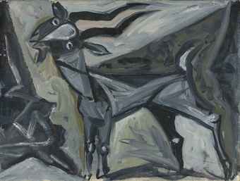
"my favourite being a small picture - a tempera I think - of a goat."

Conclusion:
"I don't know what I make of John Craxton's work.  [...]  Some of his work I really like, but there is a lot I really don't like.  His influences are possibly too readable."


Source:  Your Paintings BBC. © estate of John Craxton 2013. All rights reserved, DACS
photo credit: Tate

Reviews in the national pres


Richard Dorment says:
 "John Craxton, who died in 2009, was the last Romantic. Or rather neo-Romantic."


One of his favourites:
Doesn't cite a favourite picture.  Still Life with Cat and Child does "amount to pastiche.


Conclusion:
"He wasn’t an artist of the first rank but he was inimitable. This show is just the right scale and it comes with a beautifully illustrated book  ... by his friend Ian Collins."


Andrew Lambirth says:
"[Craxton's] finest paintings lead the viewer into a visionary universe of colour and light and bounding structures, whose taut rhythms release a feeling of euphoria in the beholder and beguile the imagination with intimations of visual splendour."


One of  his favourites:  Landscape, Malevizi, Crete
"...the finest example I’ve seen in recent years is ‘Landscape, Malevizi, Crete’ (1952), a superb balance of pattern and description. A painting of that quality and joyous, seemingly effortless execution, a perfect blending of linearity and colour, is missing from the Fitzwilliam."


Conclusion:
"Craxton is actually quite a lot better than the sum of the Fitzwilliam show, which offers only a very partial view of this complex artist."


Michael Prodger says:
" 'A World of Private Mystery: John Craxton RA (1922-2009)', a small but choice exhibition at the Fitzwilliam, is an overview and reminder of the career of this unfashionably joyous painter."


One of his favourites:  
"One of his most unaffectedly pleasurable paintings is a colour-saturated image of three sailors eating a meal of prawns, squid, sardines and salad that is mouth-watering in every sense." 

 
Conclusion:
"A man of great charm, Craxton became friends with Patrick Leigh Fermor in Greece and it is through his drawings for the scholar-traveller’s dust jackets that he is now best known." 


Source:  Christie's.  John Craxton, Grey Goat.


Reviews in blogs and the national press: a comparison

• Blogs are less wordy.  Sentences are shorter.  Blog authors adapt their prose to the way reader quickly scan the screen.


• Blogs are more personal.  Blog authors state personal preferences.  They tell stories about how and why they visited the exhibition.  One author said their friend had wanted to see it; another commented on the weather.


•  Reviews for the national press  are longer.  They include quotations (from the artist or the artist's friends).  They name influences.  They offer stylistic categories ('neo-Romantic', 'Arcadian').


•  Reviewers for the national press  sometimes assert their own credentials and authority.  The reviewer for The Spectator, for example, explained that he had himself curated two exhibitions.  Perhaps they feel the need to do this because they are getting paid?


•  Reviews for the national press can be a bit pretentious and formalist.  Phrases like taut rhythms or colour-saturated don't tend to appear in blog reviews.


•  Reviewers for the national press make more of the artist's reputation and the question of artistic quality:  not an artist of the first rank or unfashionably joyous or quite a lot better than the sum of the Fitzwilliam show.


What type of review do you prefer?  Click on the little pencil below (where it says 'no comment' or 'comments') and leave a comment. 

Also: judge for yourself and visit the exhibition.  John Craxton, Fitzwilliam, ends 21 April.
Related Posts Plugin for WordPress, Blogger...