There's a mosaic in Addenbrooke's Hospital in Cambridge.
Yes, in a hospital. You can find art in a hospital. In fact, there is lots of art Addenbrooke's, and I think it's such a lovely idea to enhance the environment for patients, visitors and workers.
Also, it's a really nice mosaic.
It's all about people reading. And disporting themselves in nature.
I do like the way shadows look in a mosaic.
How the tiles follow the shape of the objects: a 'knit' shape for the socks; a 'stripey' shape for the towel; a 'columnar' shape for neck and arms. And higgledy-piggledy colour riot for the meadow.
I love the way the black-and-white geometry of the newspaper contrasts with the floral blue-and-white tiles of the other reader's frock.
Hello, watering can, with the not-grey shadow effects.
A sweet touch, this black-and-white "poster" in a 1950s skinny-line curlicue style.
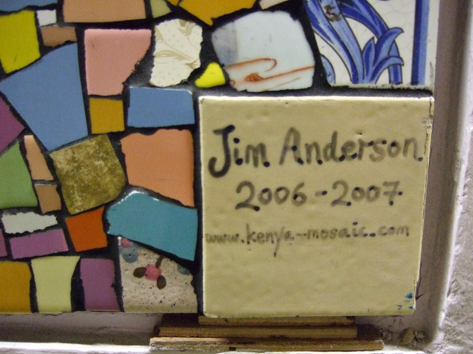
The artist is Jim Anderson. He's made a number of museums and has helpfully included his website on his signature tile. I warn you, though: the site's really out-of-date.
Let that be a warning to all artists who think it might be a good idea to include online info within their work...
Read more about art at Addenbrooke's (it's a charitable trust).


No comments:
Post a Comment