Discover the secrets behind the award-winning Sainsbury Laboratory in the Botanic Garden of Cambridge!
Well, I also visited the rest of the Laboratory and went to a talk by its architect, Alan Stanton of Stanton & Williams. Which is where I found out that the Sainsbury Laboratory is more than just a café. And more than just a lab.
Here is what I learned from the visit and the lecture:
Here is what I learned from the visit and the lecture:
1. It's a laboratory
Scientists will do pure research into exactly how plants grow at a molecular level, at the level of DNA.
The architect Alan Stanton says, "This is fundamental for the future of our planet and for survival."


For inspiration, the architects looked at other research centres, incl. Louis Kahn's famous Salk Institute at La Jolla, California.

What the architects discovered was that all the labs they visited had artificial light and confusing layouts.
For example, they found that one of the labs at Johns Hopkins University (Baltimore) has a lab on 3 floors. Each floor has a different culture, and the researchers are having huge problems in getting the 3 levels to communicate.

Stanton & Williams wanted to do something different: a work space with natural light and a clear layout.
2. It's a work space
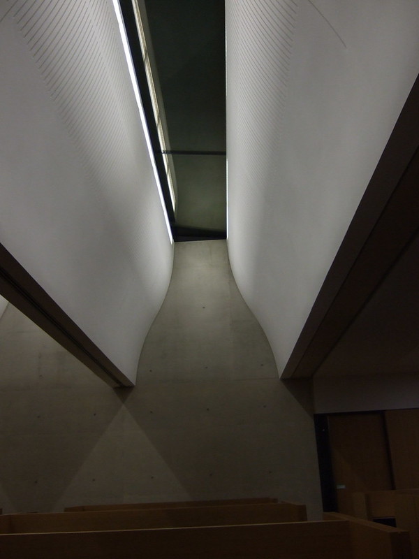
Natural light:
The labs are lit by daylight 60% of the time. The lab vents have a profile that captures light and spreads it evenly on the work surfaces.
A clear layout:
This building has only one horizontal lab level.
The basement is where different conditions are simulated for plants, e.g. the tundra. There is also a herbarium that includes Darwin's Beagle specimens.


3. It's a meeting place
One important part of the brief was: dialogue.
Stanton & Williams have an office of 50-60 architects so they know about the challenge of getting people to communicate. It's a social challenge. It's about how to make a building work socially as well as technically.
The architects went to Charles Darwin's house in Downe (Kent). Darwin was instrumental in establishing the Cambridge Botanic Garden in the 19th century. In his garden, Darwin had a 'thinking path'; he would kick a pebble along this path, do a turn, kick another pebble while thinking. Walking and reflection have long been associated.

How do you move through spaces, and how does that encourage thought and exchange?


Alan Stanton: "Where is the coffee machine going to go? That's going to be absolutely critical."
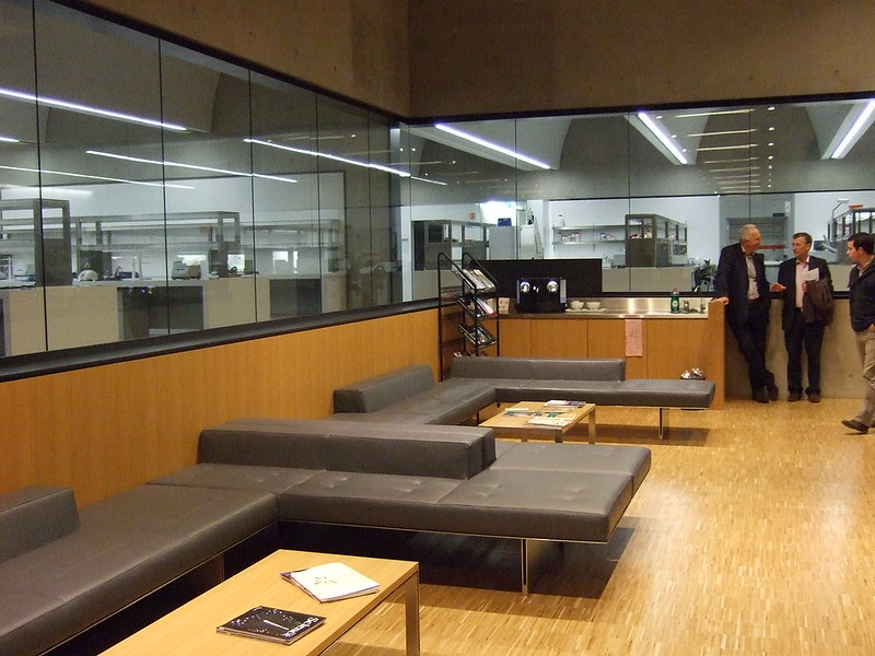
"Because accident is always part of science just as it's part of every creative art as well."
How do we express that architecturally? Corridors, laybys, movement, daylight, St Jerome in his study.
Exeter Library by Louis Kahn has little study spaces near the windows:

The study boxes at the Sainsbury Lab copied the Exeter cubicles. The study boxes have whiteboards and seating.
Note the little boxes: the box holds felt pens, and the lid is a board wiper!

Scientists have been here...
4. It's a machine for living in
A machine for living in: that's what the French architect Le Corbusier called the modern house.
The Sainsbury Lab is definitely a machine. The interior here is probably as complex as the interior of a Boeing 747's wing (says Alan Stanton).
Labs cannot vibrate so the floor cannot vibrate. There are 17 meter long runs of straight concrete.
5. It's a sustainable building
Labs are "energy-hungry" (Alan Stanton). There's a lot of passive energy in this building to make up for this. The building got an excellence award for sustainability.
1000 square metres of voltaics (solar panels) on the roof produce 10% of the electrical energy used.

But there's also nature:
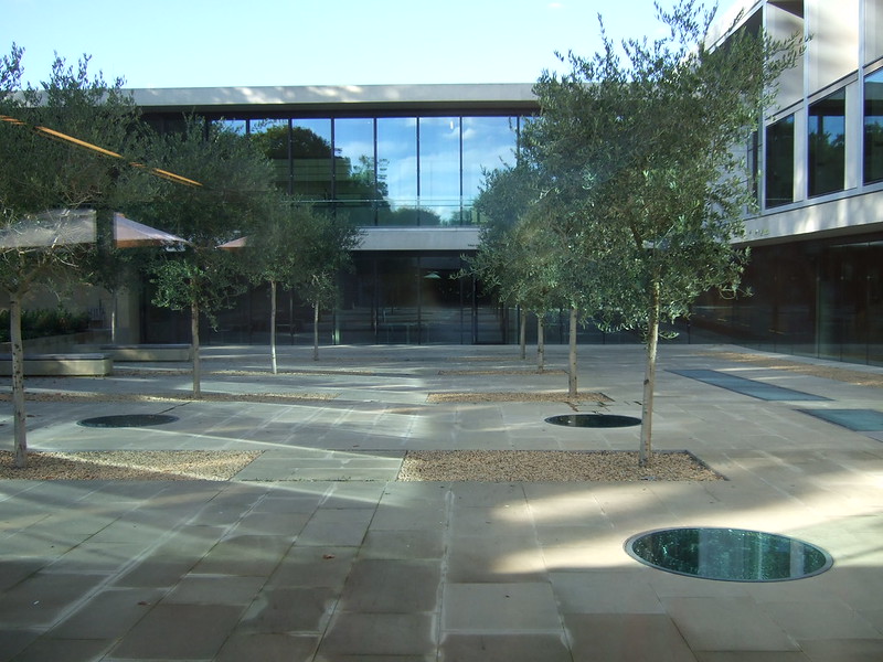
6. It's two groves of trees.

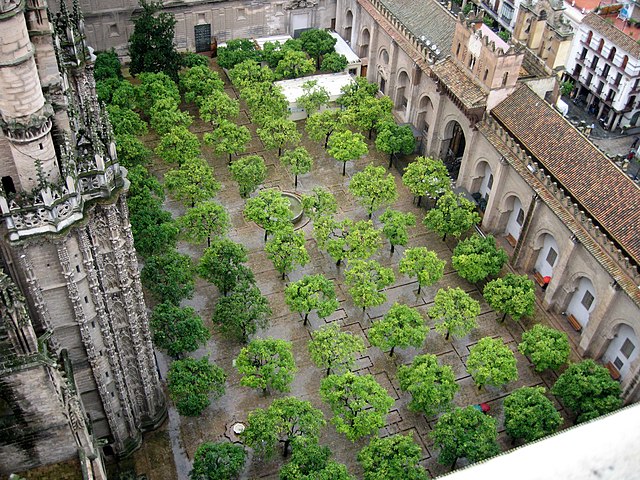
Stanton & Williams found inspiration in local courtyards in Cambridge, and at the Patio de los naranjos in Seville.
Stanton & Williams designed a courtyard out the front with gingko trees, and a courtyard out the back with olive trees.
The gingko grove.
7. It's a home for art
The architects are very interested in art and work a lot in art galleries. They are inspired by the sculptures of Ben Nicholson.
So the floorplan looks like a Ben Nicholson relief.
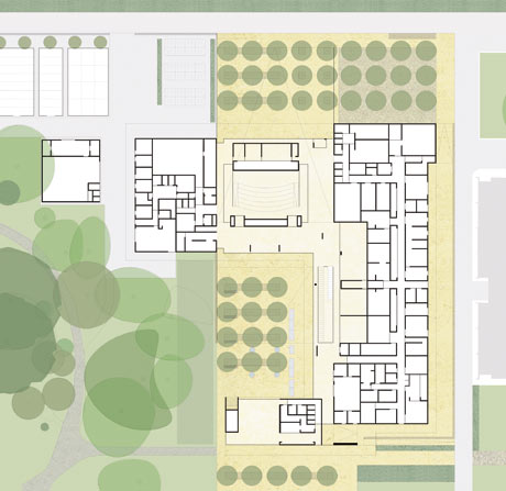
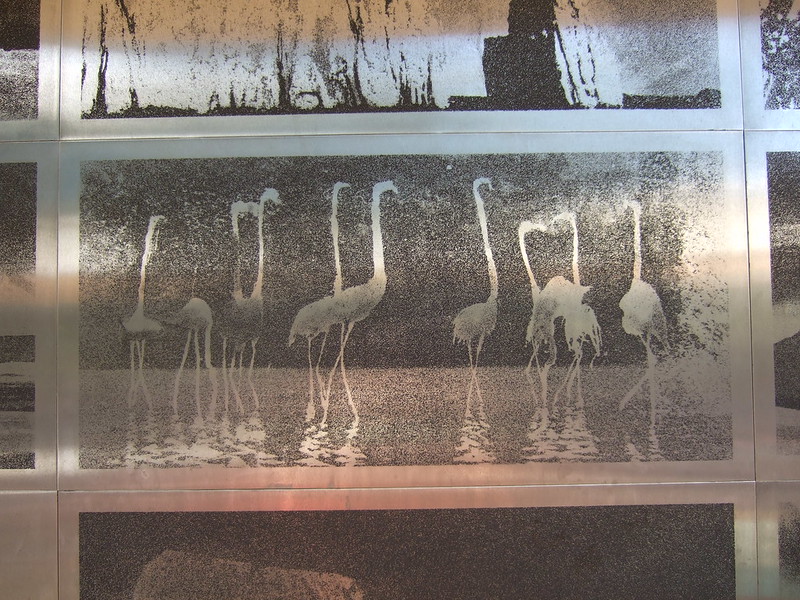
Three artists were commissioned to make work for the building.
The artist Norman Ackroyd did a mural for the café terrace, based on his trip to the Galapagos Islands (in Darwin's footsteps). His mural is etched into stainless steel. These are normally used for printing but here the actual plates are displayed.
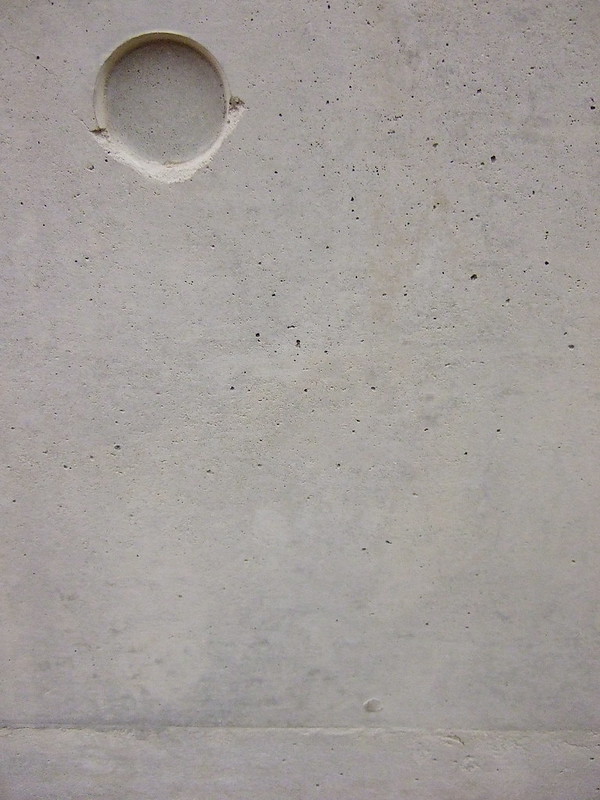
Susanna Heron did the relief carving on the wall next to the auditorium, inspired by the herbarium. How to light for relief? The architects went to see how this was done at the Assyrian reliefs in the British Museum.

The inner olive courtyard has four sculptures by William Pye, Starbursts. They are fountains with glass over them; water sprays up with a light inside.
8. It's a café
The café is the only area of the building accessible to the public. The new café suffers from its own popularity: it has 3 times as many visitors as did the previous café.
But in fact you can see inside the labs from the café side: the most publicly accessible lab.
More in my post on the café.
9. It's a thing of beautiful craftsmanship
The clients were the University of Cambridge and the Gatsby Foundation (one of Lord Sainsbury's charitable trusts). Their clients indulged the architects' 'labour of love'.
For example, all the seats in the auditorium were designed with a furniture designer; the leather was all sourced from the same herd of cows in Scotland and treated at the same tannery.

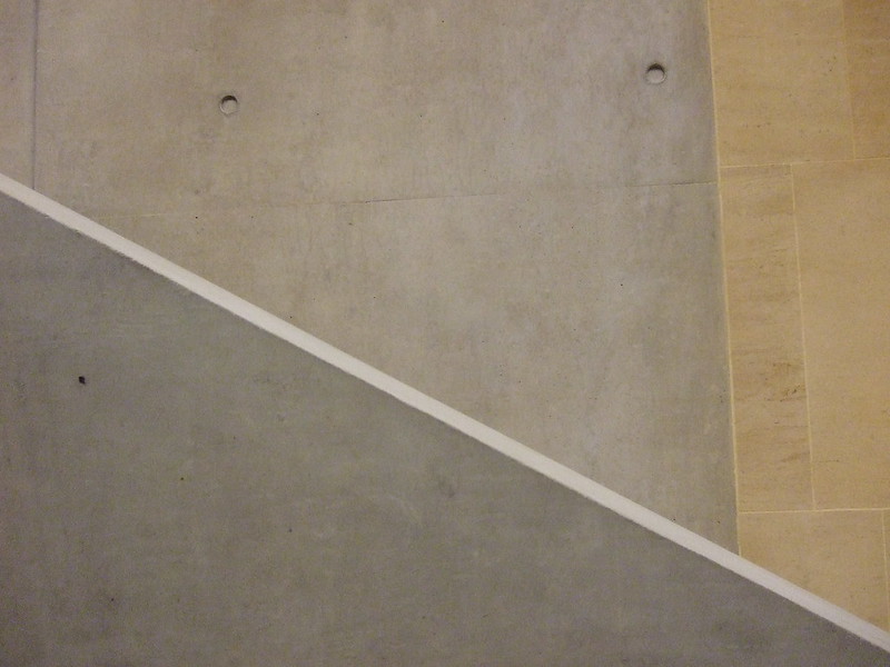
The architects chose concrete because it's very versatile, flexible and plastic (as in formable). When you design a concrete building, you build it twice: first you build it all in wood, then you pour in the concrete and build it all again.
The stone was quarried near Metz in France. The architects wanted Cambridge stone but were unable to get it. Using stone helps to elevate the concrete into the noble material it actually is.
Notes:
The building took around 2 years to build, was finished on time and came in under budget.
Stanton & Williams also designed a venue that was used for the 2012 Paralympics. Alan Stanton gave his lecture from his wheelchair.


The clients wanted world class architecture for world class scientists, incl. Nobel Prize winners, from all over the globe. The building has to be flexible because we don't know that the research will be. They also wanted daylight and a generosity of proportion.
The brief: a building that has daylight, is all on one level, and facilitates communication.
The talk was organised by RIBA East and took place on 4 October 2012. I don't know why it's taken me such a time to post about it... It feels odd to post these autumnal pictures on a snowy Cambridge night!
This post is for my son JALC who asked for 'more architecture'. :)
Thanks for reading!
Part 1: Botanic Garden Café, part of the Sainsbury Lab
Find out more:
Gazetteer of Cambridge modern architecture since 1945 (download as PDF or read online); published by the Cambridge Forum for the Construction Industry
Watch a video of the Sainsbury Lab on the Stanton &; Williams website. (Scroll down.)
Permalink: http://artincambridge.blogspot.com/2013/01/architecture-in-botanic-garden-part-2.html


Great post! It probably took so long to write because it is awesome! And thorough. What am amazing building - I love the natural light embouchures.
ReplyDeleteThanks so much for your lovely feedback! I'm so happy that I managed to convey some if this building's wonderfulness. I really was very impressed and astounded to find such a world-class piece of architecture on my doorstep. Plus it won the RIBA building of the year award, yay.
Delete